Nijmegen Component Library
This library has been created to facilitate Gemeente Nijmegen in a uniform and consistent visual representation throughout all her digital exposures.
The goals of this component library are:
- A deeply integrated, living part of a website or application’s codebase.
- A code and documentation deliverable for implementation by an in-house team.
- A code and documentation deliverable for implementation by a third party development agency.
- A reference document for different teams, to ensure consistency between sites and/or platforms.
Built upon MDB framework with custom styling specific for Nijmegen.
Component listing
On the left-side you see all the components which are marked to be used by Nijmegen based on the components from the MDB framework and styled specific for Nijmegen to create a consistent look-and-feel.
When a component has multiple visual representations, it will act as a folder marked with an arrow in front of the components name. Unfolding such a component will list the various versions which can be viewed separately.
Component view
By clicking on a component from the listing on the left you will see the interface change to underneath screenshot.
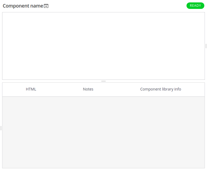
Here you will see the components name, it’s status on the right of the name, the preview pane under the name and a pane with several tabs (HTML, Notes and component library info) with more in-depth information regarding the component.
By clicking the name of the component and/or icon you can view the component as it’s rendered in the preview pane only now in a separate URL without the component library layout surrounding it.
The pane with the several tabs provide information mainly aimed at implementors.
| Tab | Description |
|---|---|
| HTML | A copy-paste ready HTML markup of the component |
| Notes |
When applicable, specific information for the component documenting for instance |
| Component library info | Some in-depth information regarding the component mainly aimed at developers of the component library |
Component statuses
Components and their variants have been given statuses reflecting their state of completion. Next to the components name in the listing on the left, you can see (based on the color of the dot) what the status of the component is. When viewing a component, the status can be seen above the preview.
| Label | Description |
|---|---|
|
|
Do not implement. |
|
|
Work in progress. Implement with caution. |
|
|
Ready to implement. |